LET GO : : deep thoughts by Lysa Flower

I always have an vague idea of what I’m wanting to do with a piece. The journey, like many creatives have written about, is U shaped. Starting at the top of the U: "This is such a GREAT idea! (sketching and inking)". To the bottom of the U: "Ugh! Why is this falling apart in my hands (realizing it feels a little flat)". To climbing up the other side of the U: "Okay, that’s interesting, (breaking it on purpose, pushing the scale super large or super tiny) what if I?… to Wow! I LOVE THIS!".

That U feeling; it’s kind of like riding a wave I suppose... AND like the ability to LET GO of expectations, disappointment, each moment. When I really started to think about it, the need to LET GO might be the purpose of life… Whoa, that got deep fast! All I was trying to say was that I LOVE when hand lettering and patterns go together ;D


ENDLESS SUMMER : : VANS

One of the very best parts of Tofino, other than the beaches and waves, is Tacofino, a parked food truck that serves tacos and my very favourite, Diablo cookies!

So there we were, after a day of attempted surfing (but successful boogie boarding), we thought we’d head into town to Tacofino. As we were driving to it we saw it! The most beautiful van I had ever seen…

The next day we went back to Tacofino for round two, and we also enjoyed ice-cream at Chocolate Tofino. While waiting in line for the ice cream I noticed this chalkboard painting of a van with surfboards stacked extremely high on it (I thought it was funny and took a very fuzzy photo of it). While I didn’t stack my surfboards that high on my vans they definitely influenced mine! Inspiration was everywhere on this trip!

I haven’t even told you about the sunsets yet! They were blazing and reminded me of the Endless Summer movie poster, hence the name for the top left print.

With every collection I love to do a standalone illustration for the name of the collection. While playing with some markers, I came up with the goin’ surfin’ lettering and ended up incorporating it into a tossed goin’ surfin’ van print.

So the moral of the story is, eat Tacofino, it’s good for your health, especially the diablo cookies, as is ice cream at Chocolate Tofino! Oh and yes, inspiration is everywhere… especially in Tofino!


PRETTY PLEASED ABOUT PURPLE!

… BEFORE IT USED TO MAKE ME PUKE! Okay well that’s a bit dramatic but it has been on my “No thank you” list for a long time. When I started designing for my Goin’ Surfin’ collection I wanted to push my colour palette and decided now was the time to make friends with purple. I had done it with grey about ten years ago, so I knew it was possible. Have you ever had a colour aversion?

I think A LOT about colour and I’m curious about these aversions. I don’t know what it’s like for you but for me colour is instinctual. I’ve taken all the colour theory courses, but to be honest, I can never remember all the rules. All I know is when I use certain colours or combinations they give me strong feelings that I react to.

I know about the symbolism of colour, which I find surprisingly conflicting for some colours (like yellow which can be both happy and anxious). I know purple is a hard colour to make and that’s why it was reserved for royalty, but that never helped me warm up to it.

Then there’s a psychology to colour but I think it gets muddy with your personal relationship to it. Let’s say a colour was a hot trend when you were a kid, for example avocado green, and you have memories of your mom making you peanut butter and jelly sandwiches as you basked in your avocado green kitchen. You might have warm fuzzy feelings whenever you see avocado green but others might have the exact opposite reaction to it.

When it comes down to it, I think the specific hue is the important factor to making friends with a colour. For example, my father in law and I both love yellow. Except, he loves school bus yellow and I love a bright lemon yellow. To me, it’s not the same colour at all! Kind of like growing up with other Lisa’s in my class room. I didn’t think of our names as the same ever, even though they sounded the same!

So in the end, I searched and found a hue of purple I adored and used in Goin’ Surfin’. Not only did I stretch my colour palette, I finally made friends with purple and I LOVE what it did for this collection, especially my Sunshine Floral! Those pops of purple really made it sing!


A DRY HOT SUMMER, IS NO TIME TO PLAY WITH MATCHES!

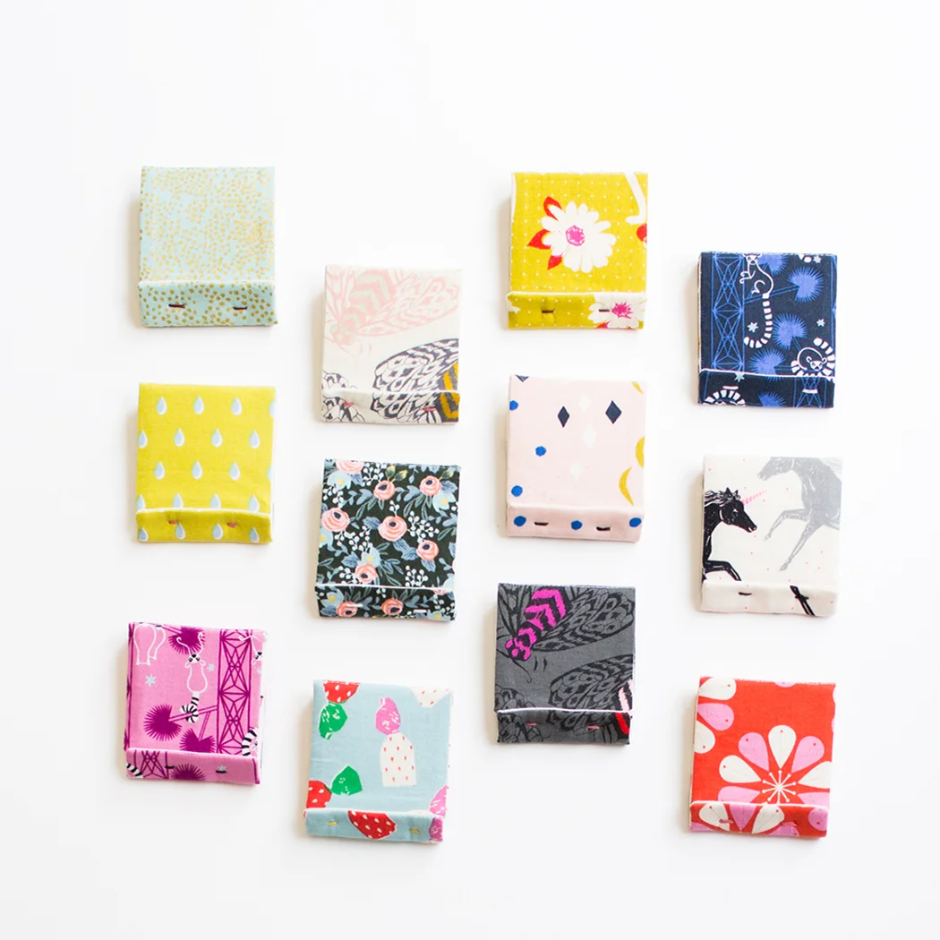
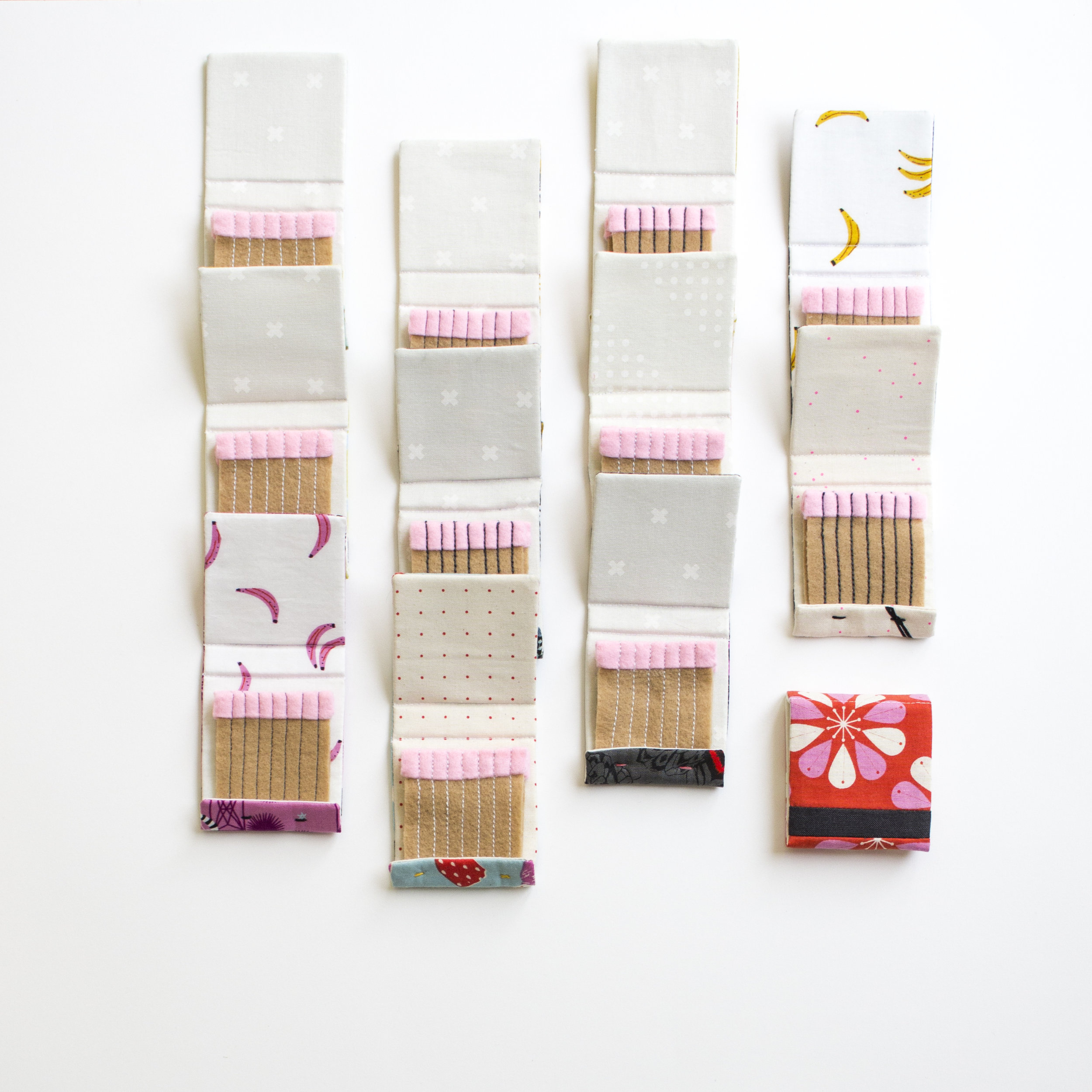
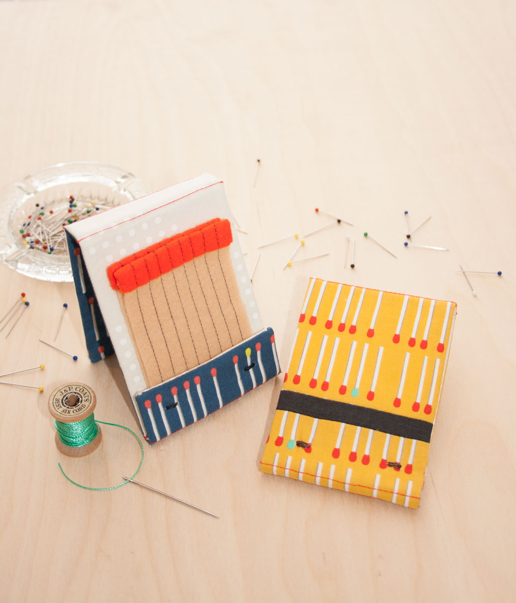
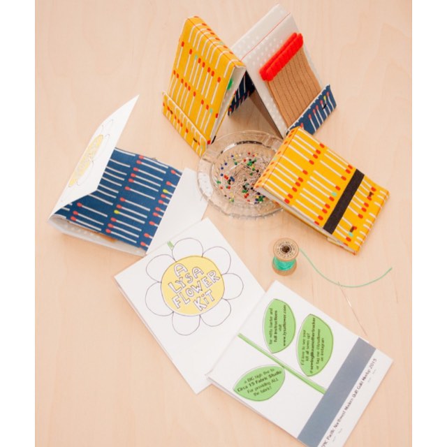
Unless... they're made out of fabric and felt, right?! The very first pattern I ever wrote was for my Match Book Needle Books. That was back in 2014. In 2015 I was invited by the Seattle Modern Quilt Guild, who was hosting the Pacific Northwest Quilt Guild Meetup, to do a make and take for their sew-in. Circa 15 Fabric Studio supplied the materials and we made the cutest little match book kits for the Match Book Needle books (perhaps I'm bias, wink, wink!). Since then the pattern has been free and on my site. I've just recently added it to Craftsy as a free pattern now too.

These recent Match Books are mini's. I had scraps of felt and somehow thought they'd be faster if they were smaller. Nope! I would have been better sticking with the regular sized ones. Lesson learned!

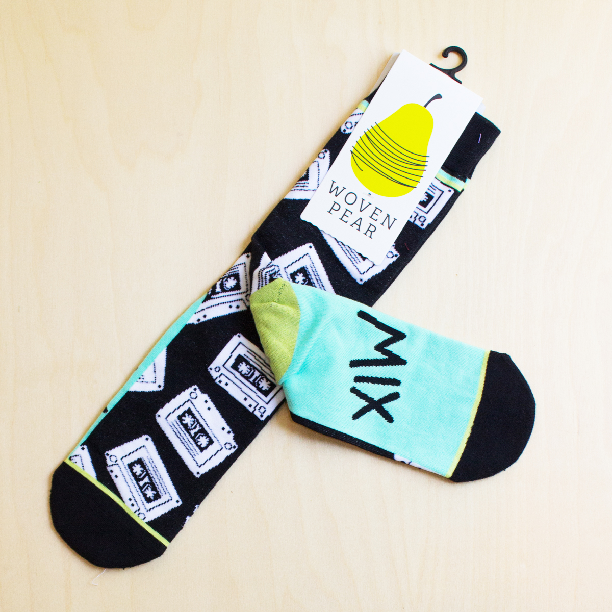
Now, I'm going to come out and just say it. I'm ready for fall. I've started longing for it. I've been missing our regular routine. I've grown tired of everyone going in different directions. I'm also looking forward to cooler, sock wearing weather... you see, I really love socks! My lovey friend Reece @reecemontgomery recently gifted me these cassette tape socks. Gah! I'm dying to wear them! The bottom of them say "MIX TAPE"! Check out Woven Pear's nifty site HERE!

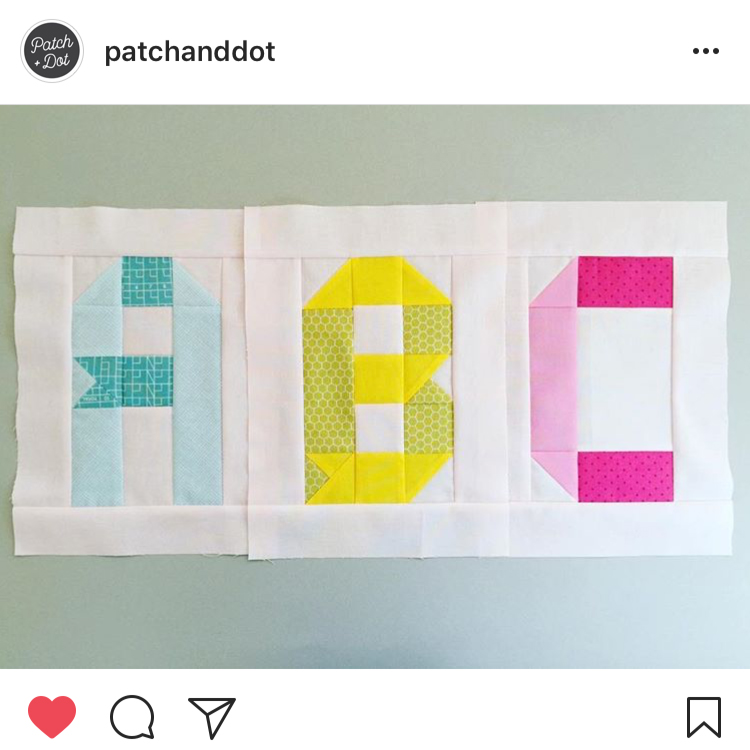
And in the theme of longing for fall, I came across these ribbon ABC blocks by Stephanie from @Patchanddot. They're so dreamy and they're free!!! Free I tell you, free! You can download them from HERE.

RECOMMENDED FOR YOUR BACK TO SCHOOL PLAYLIST: One of my all favorite time songs (it almost makes me cry every time I hear it), WE'RE GOING TO BE FRIENDS. SIDE NOTE: I found this interesting video called, HOW JACK WHITE USES COLOR. Perhaps that's why I've always been a HUGE Jack White fan. I'm such a sucker for colour and design!

#putacassettetapeonit

I've been off the grid lately. I've been in the depths of writing my boombox pattern (side note spellcheck is pretty sure when I write "boombox", I mean boob box... interesting). 

While I've been underground I have been enjoying the notifications from Instagram. It seems people are using my cassette tape pattern and putting them on zippy pouches! So clever! I was chatting with my friend Dana (@danahannah310) about how we should, instead of Portlandia's "put a bird on it", we should flip it to "put a cassette on it"!

Which brings me to these photos. This is Sherri (@sherrichalke). She's a ray of sunshine! She tested the Hard-core Mixed Cassette Tape Pattern and  when she was done the mini quilt, she used the cassette pattern pieces and combined them with Sonja Callaghan's (@artisania) bag pattern (second, side note: Sonja taught me how to paper piece!) Sherri and I went to Quiltcon 2016 together and I must say the bag was quite the hit. But I think also because of her sun shiny smile!