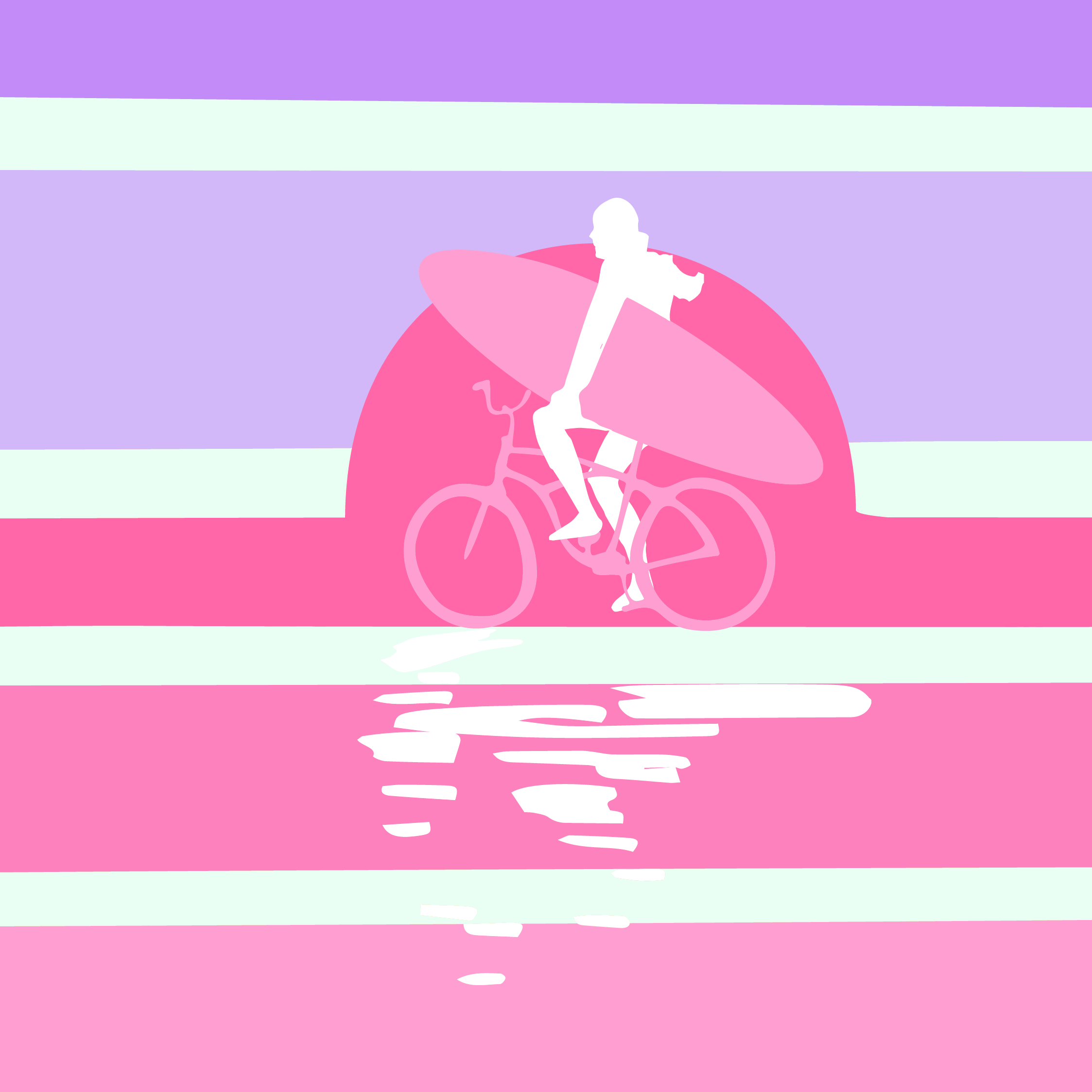
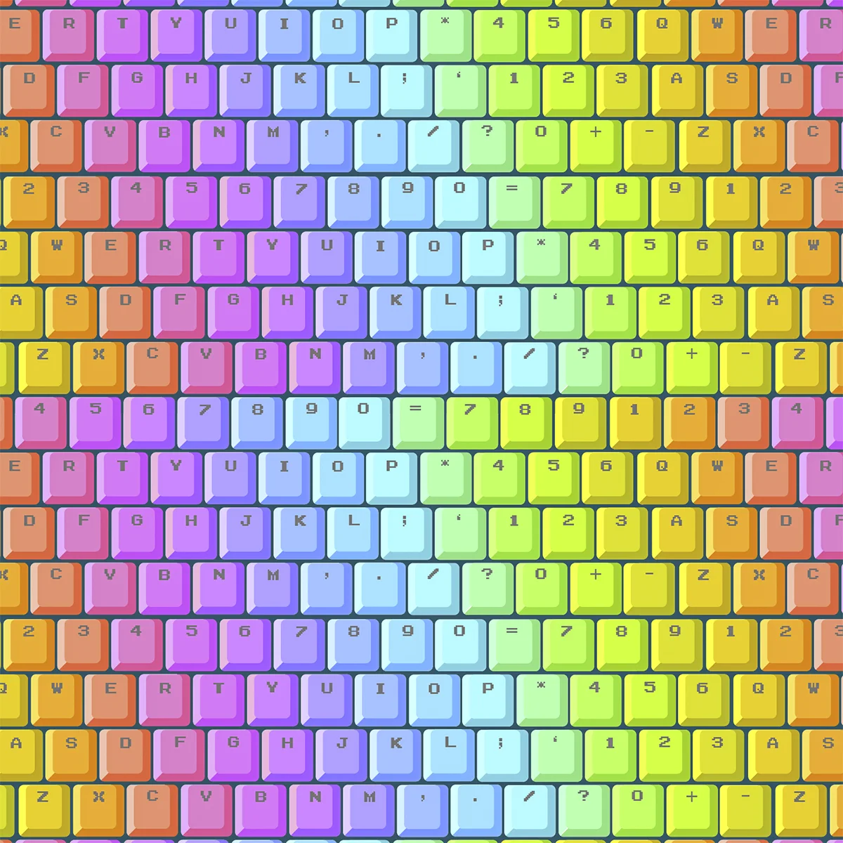
It feels seems silly to cite a TV show as inspiration. Although, when I think about it, technology is all around, plus with a husband that makes video games and two die hard gamer sons… maybe it was inevitable? After all it was my husband who gave me a white rainbow mechanical keyboard for Christmas (another inspiration) and suggested using the Atari 2500 colour palette for the collection. However the TV show I’m referring to is Halt and Catch Fire. It’s set in the early 80’s when the race was on to make the next best computer. Cameron, a young technological prodigy, is poached from university to help reverse engineer an IBM PC. Oh did I mention, she’s a female coder? A punk female coder! Gah! I loved her character so much!
This got me thinking about women in games, coders and the ones I know. I think it’s fair to say, at least in the gaming industry, the male to female ratio is still disproportionate and that male interest still dominates the themes of most games. I have hope though, especially after listening to an interview with Tina Fey on “My Next Guest Needs No Introduction”, with David Letterman. She talked about being the first female writer on SNL and how the male writers weren’t trying to be anti-women, they just didn’t understand Kotex pads could be funny. It was a boy’s club but with women on the team, adding diversity, the writing became stronger. I’d like to think games are going that way too.
Zoe Flower (her real last name, not mine) is one of those women. She can hold her own in a room full of rah, rah men. I’ve see it. It’s glorious! She’s been around since the early 90’s and has paved the way for a new generation of women in games. She started off as an animator but eventually became a host on Electric Playground. She left EP to produce her own show called Hardcore Candy (about women competing in extreme sports). Then she went on to become a game designer and then a mom, and kept kicking ass as a design director… phew! She’s packed in a lot!
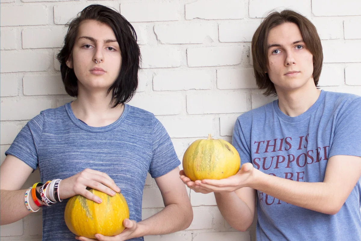
Which leads me to the next generation. Our oldest son has been working on his own indie game with a gifted programmer (she’s on the left). Taylor is a brilliant coder, one that in her spare time orders drills off Amazon so she can take them apart to build grappling hooks. Why? Because she can and I love that! She tries something, if it doesn’t work, she keeps at it. “Fail Fast” is a coder saying and she lives by it. If she makes mistakes, she figures it out and moves on (note to self!). The DIY attitude Taylor has, reminds me of Cameron in Halt and Catch Fire and I’m SO excited for her future.
And last, but not least, in noodling around the internet I found this: Girls who Code, self explanatory title right?! They have American and Canadian groups, in case you have any young women in your life who are interested. I’d love to hear how they like it.
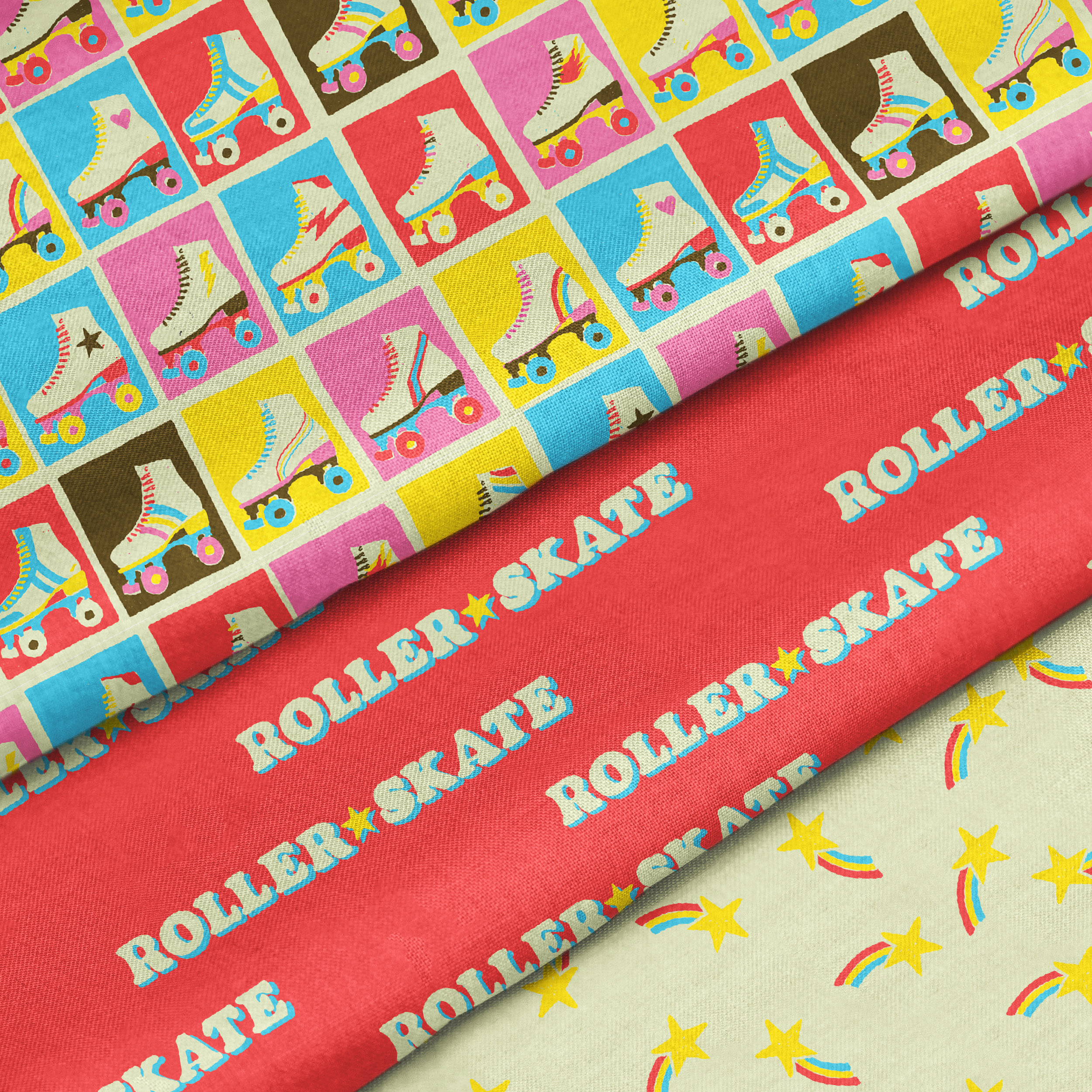
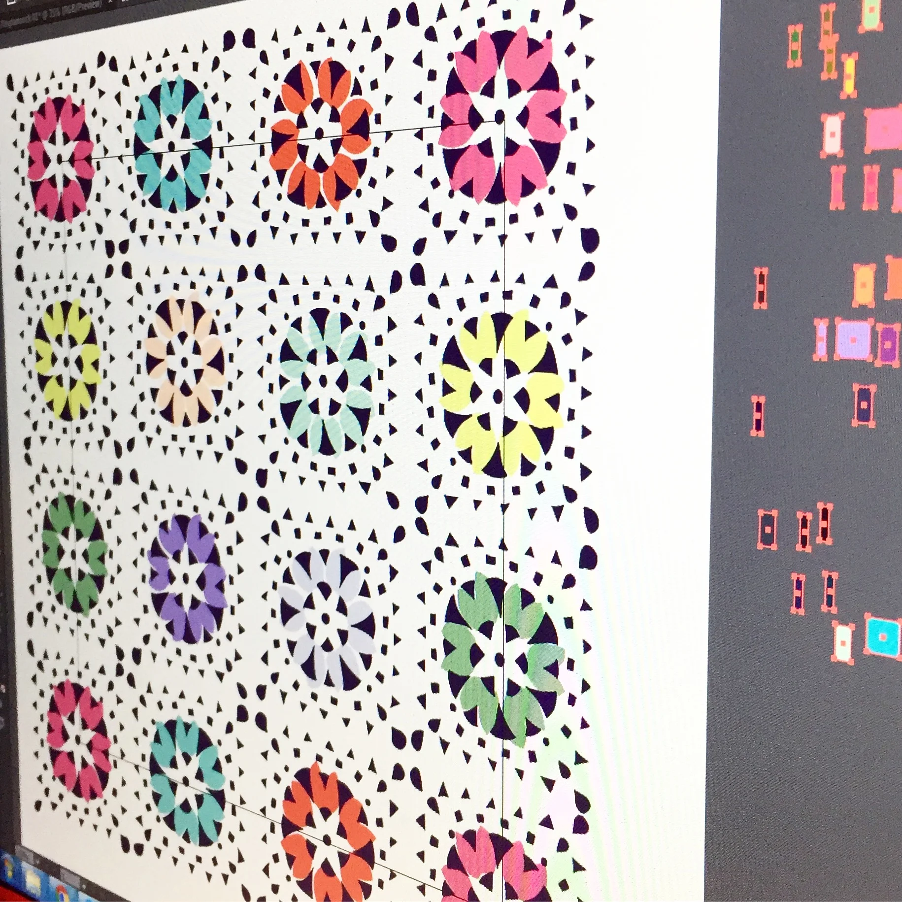
Long way around, this collection with floppy disks, ASCII, binary, keyboards, joysticks, printed circuit boards and pixels is about these women: the ones before, the ones now and the ones to come.